OBJECTIVE
The Redwood City Education Foundation asked me to create another original poster for the yearly benefit concert that they host.
PROCESS
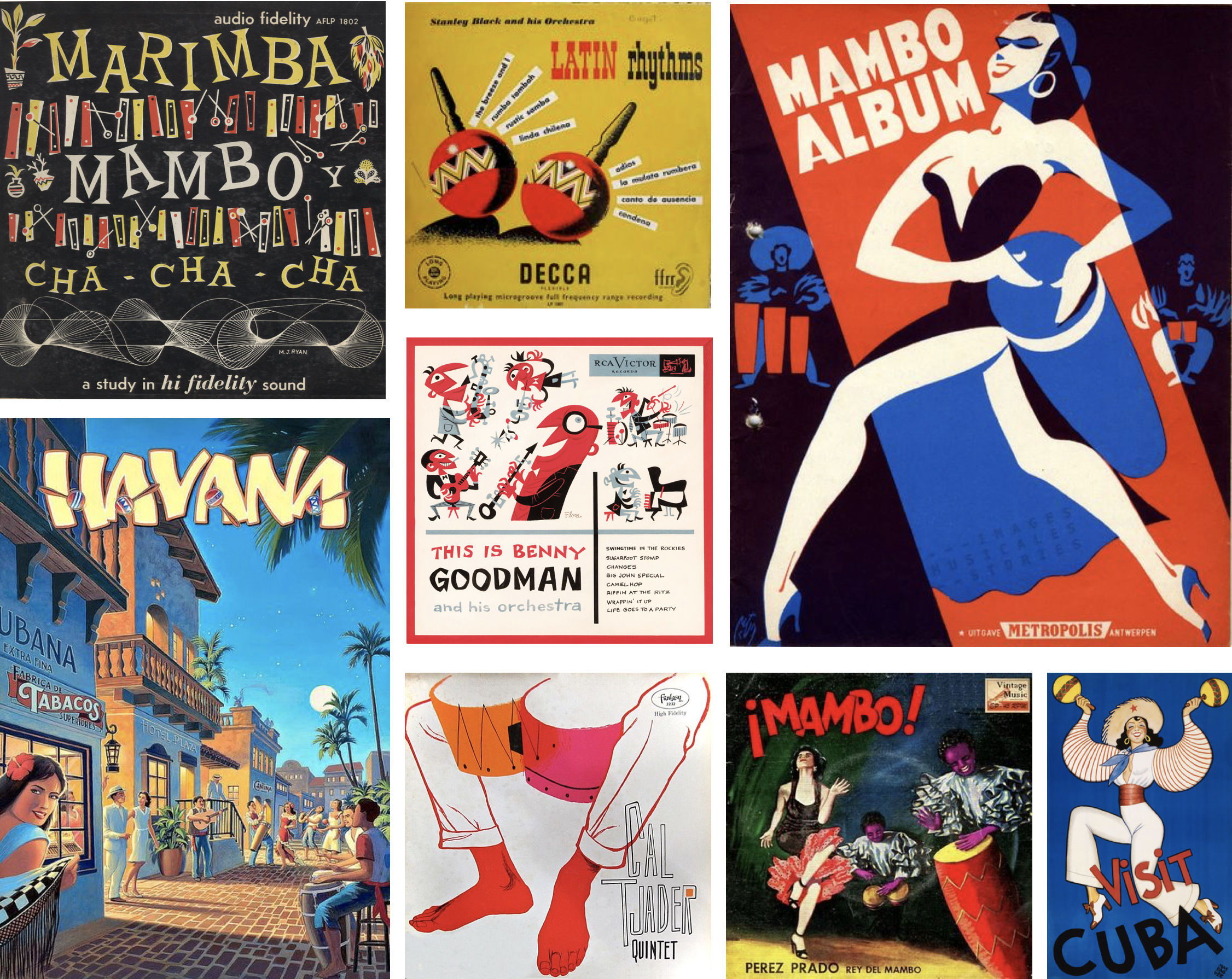
I started my research into the rich history of mambo and made a word bank, which usually helps me in my early phase of concepting. I drew inspiration from mambo and big band record covers with lively colors and unique type, as well as Cuban travel posters.
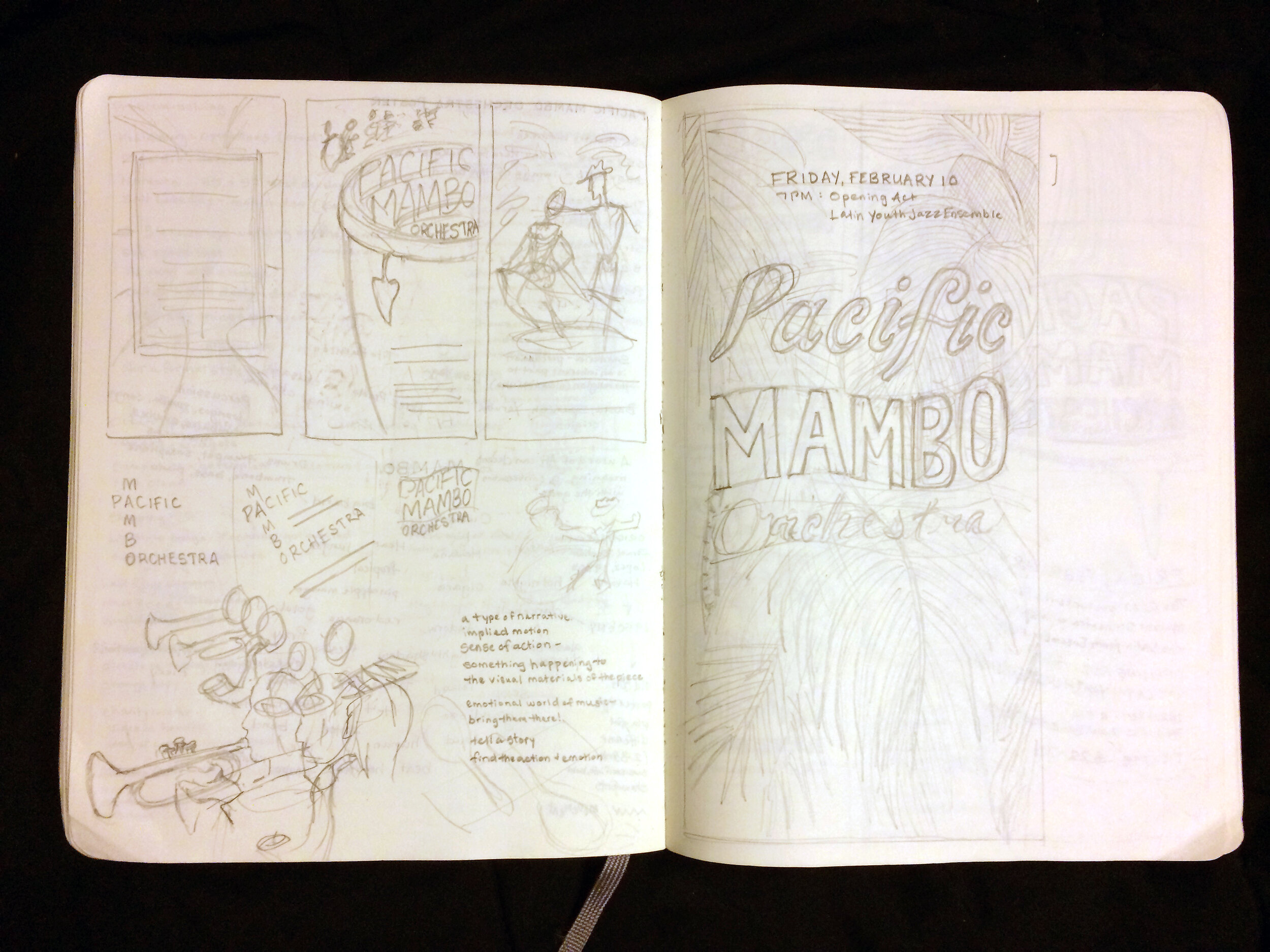
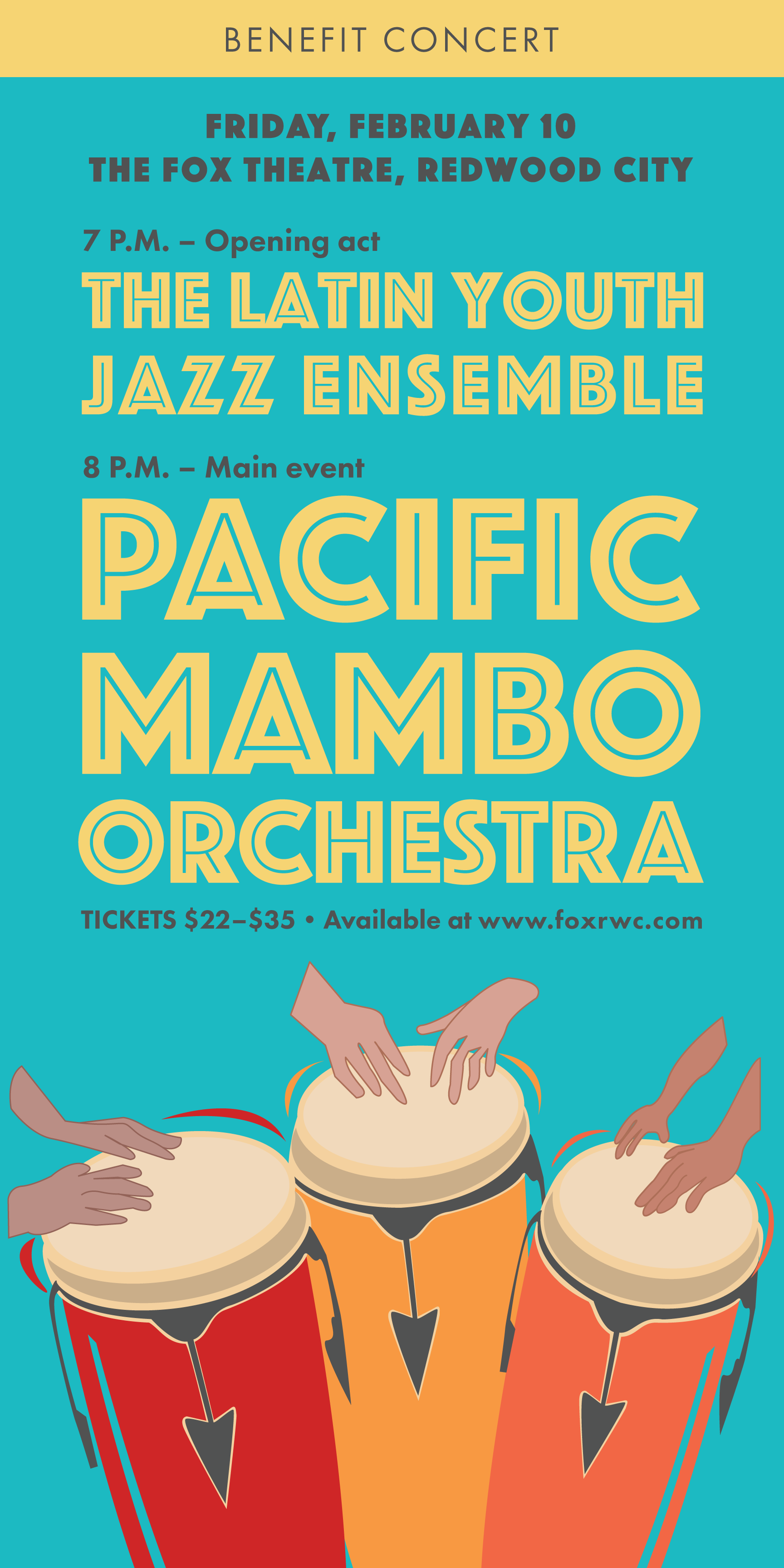
Early, loose sketches help me identify the feeling I want to evoke and which imagery might work best within a composition. I wanted the info to be clear and easy to read, but not feel heavy or overwhelming. I also wanted clear hierarchy and lively type. Some of my favorite designs included conga drums, because it’s a main instrument in mambo music. Mambo translates to “a conversation with the gods.”
SOLUTION
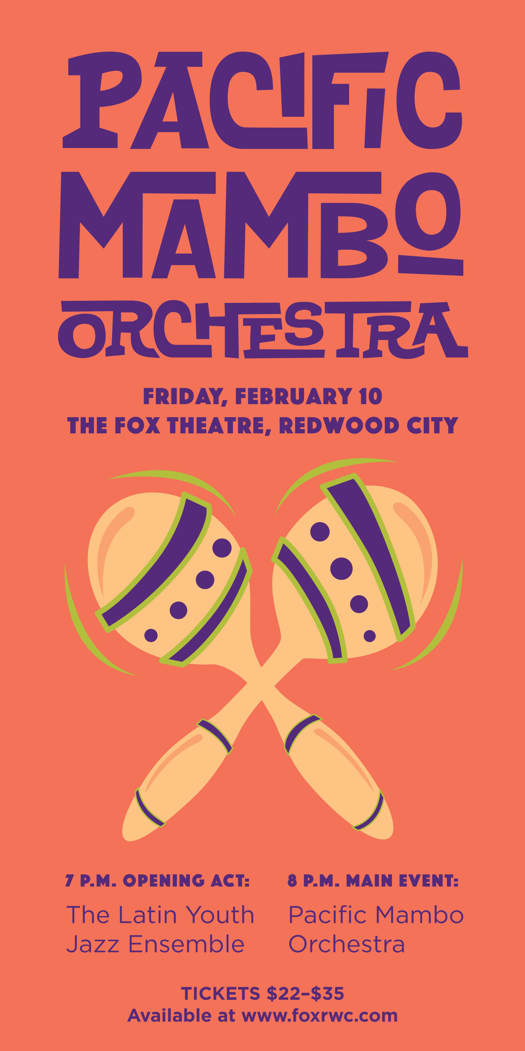
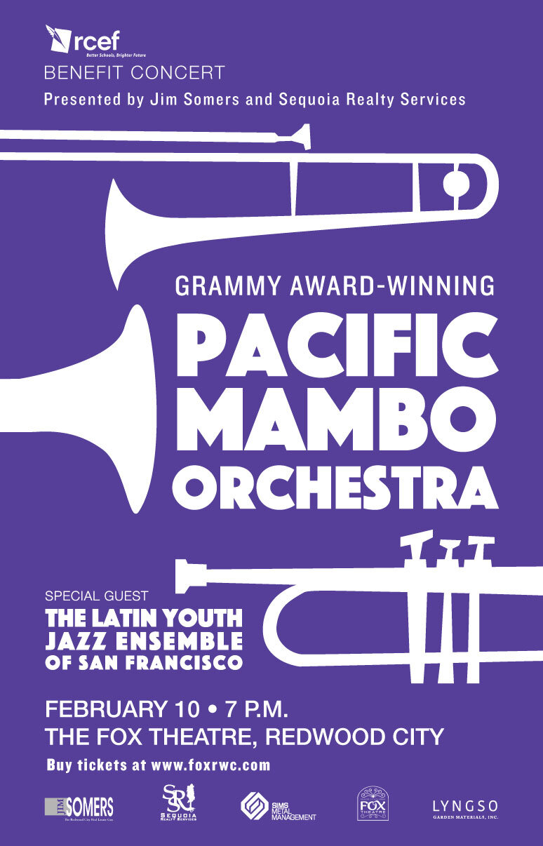
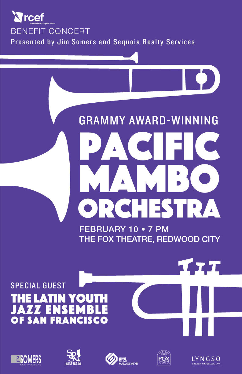
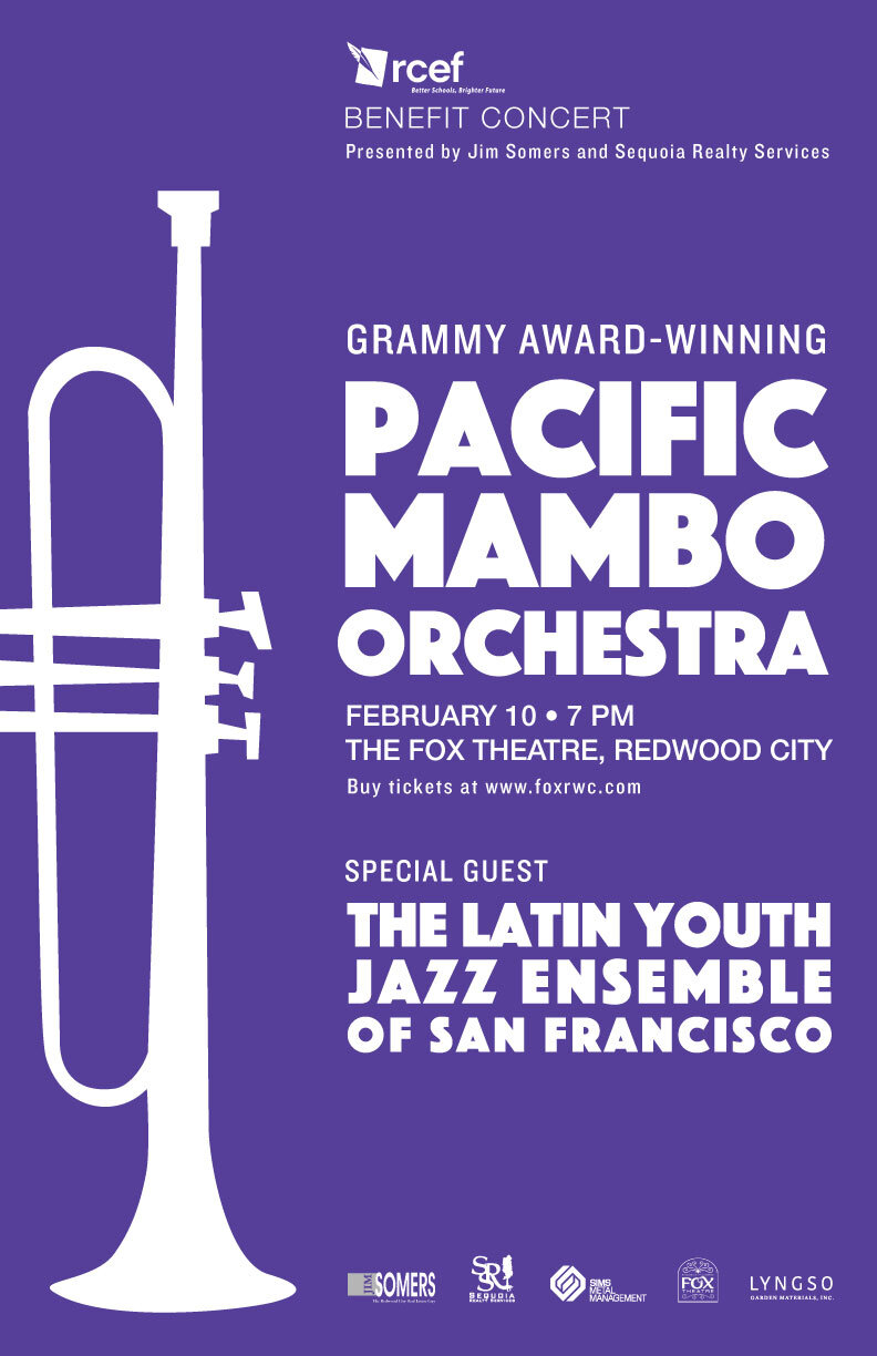
After sending initial concepts and much deliberation from stakeholders, they decided on the violet version with the brass instruments. In the later stages, they needed to add sponsor logos and additional information. It was challenging to keep the layout interesting, yet still easy to read, and I sent back these three options:
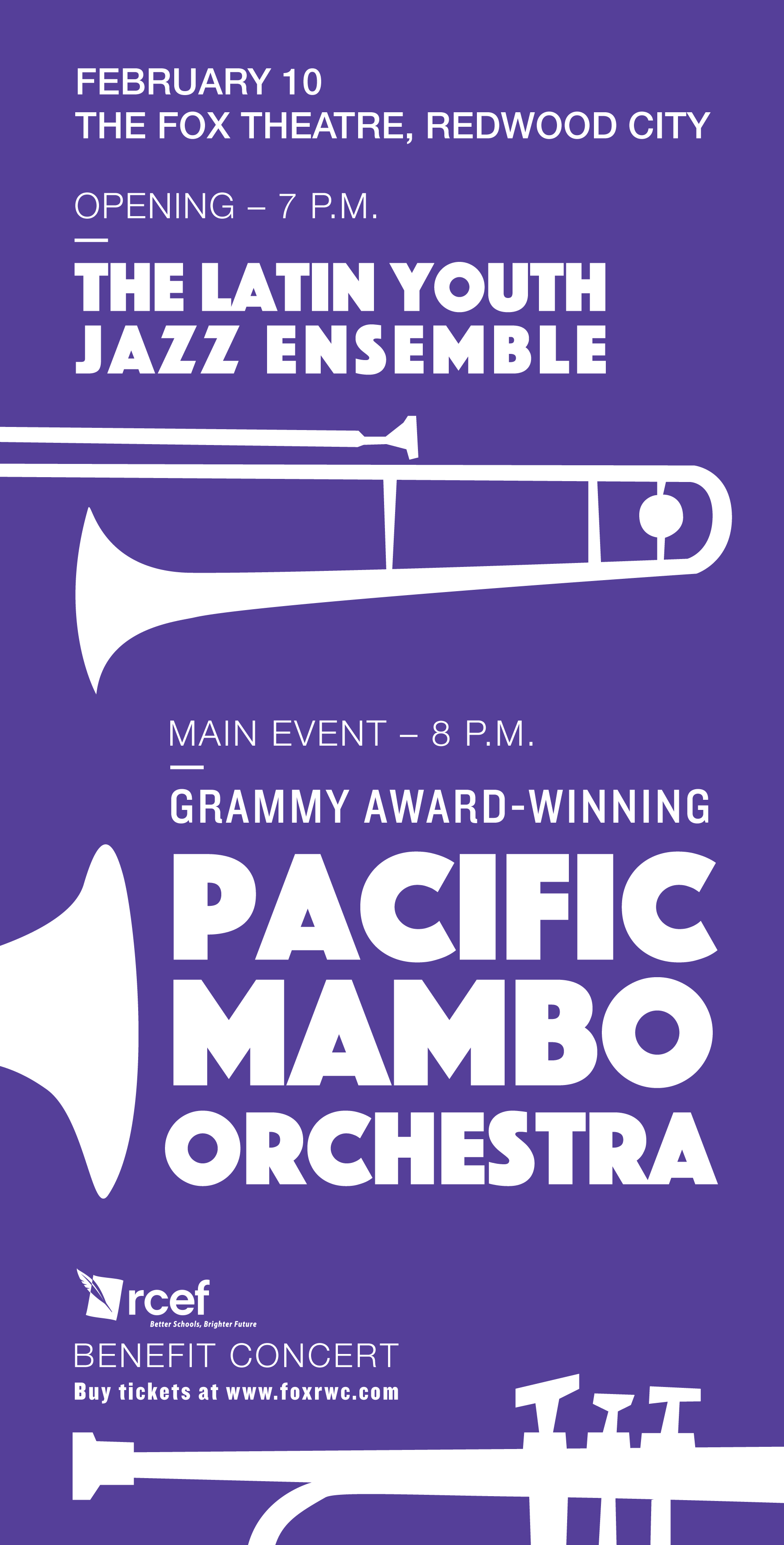
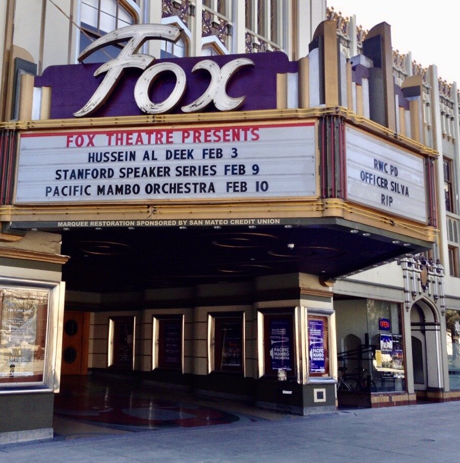
Along with the posters, I designed postcards for the event as well. They chose the middle option and were kind enough to send a photo of the poster hanging outside of the theatre.


