OBJECTIVE
RCEF needed a cinema poster, a street poster, and web assets within four days. I was referred to the band's graphic design page for any assets I might use. The goal was to promote the event around town through the posters placed at various spots around the community, and show banners online ahead of the event.
PROCESS
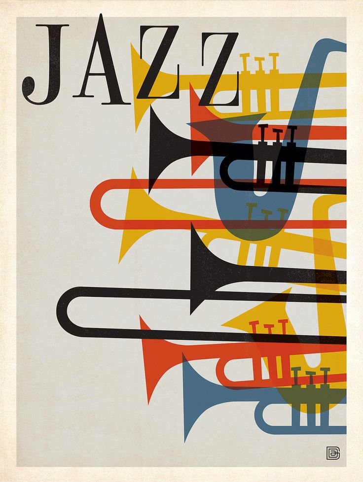
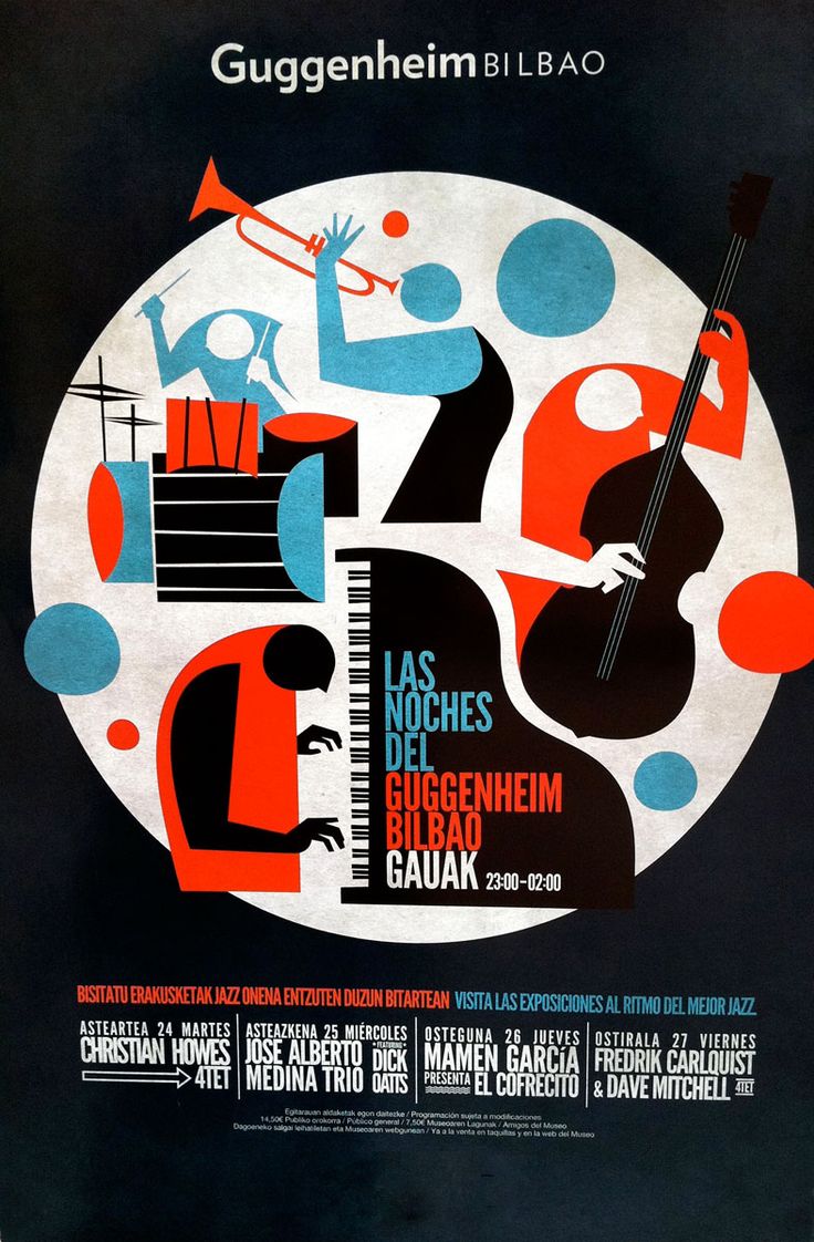
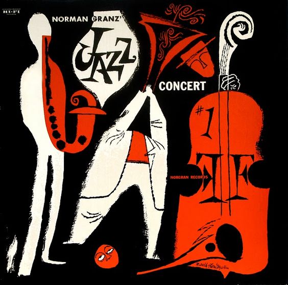
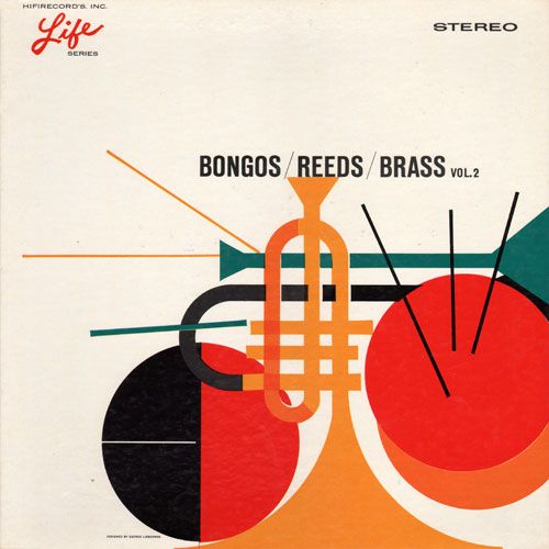
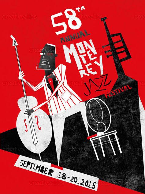
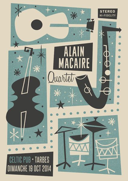
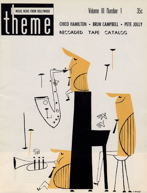
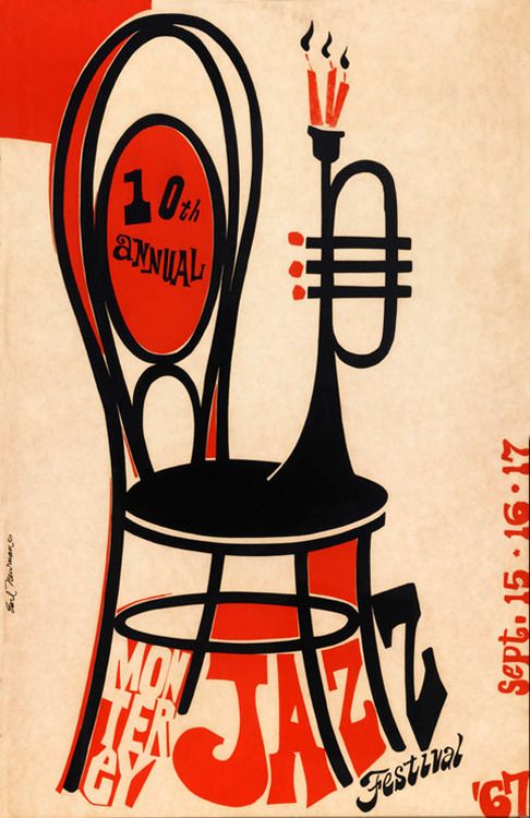
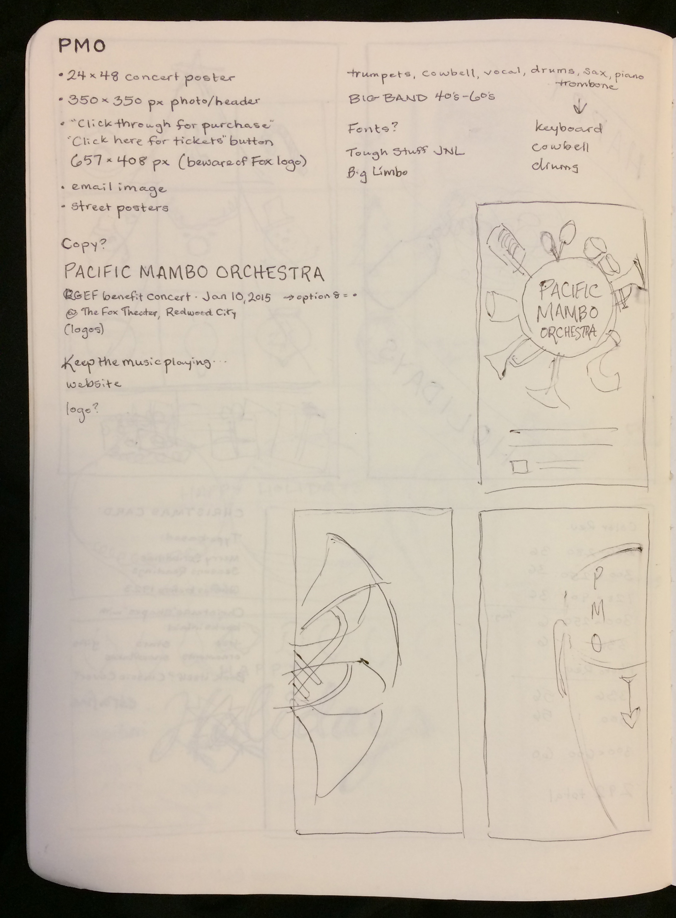
Since the timeline was relatively short for this project, I did not have as much time for ideation as I would have liked. I began by scanning for inspiration through vintage jazz posters, as mambo and big band music share a lot of similar passion and instruments.
With a tight deadline, I didn't have as much time for ideation as I would have liked, but I sketched out a couple quick thoughts:
I executed a few ideas while communicating with the copywriter and the RCEF. We had to iterate quickly, and there were many people involved with certain opinions on changes to be made. I decided to make something as close to the version that they wanted to see, and one that I would be happy with.


They wanted photographs of the band on the poster, but also wanted illustrations to "liven things up." My main concern in this was that using illustrations paired with this photography may come across a little like misplaced clip-art. I also wasn't quite sold on my favorite of the drafts, and was determined to improve the illustrated version. I wanted it to be less busy and have more movement.


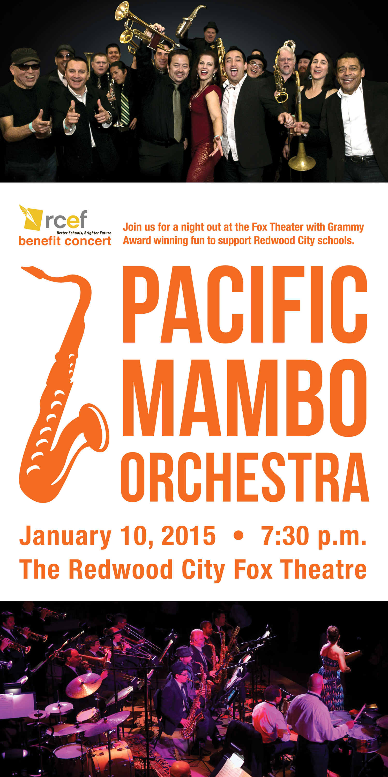
After my second round of revisions, I was able to discourage the use of the photos because the resolution was too small to use at any large scale. I assured them that by creating vector illustrations, we would me able to resize more easily without losing clarity or quality. They were on board. After narrowing the recent design down to a few typefaces, I went with a bolder look:
