A messaging app rebranded to express collaboration and integrated execution
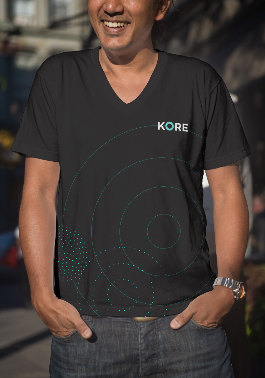
Kore is a messaging platform that utilizes bots to organize and execute tasks from various sources (including email, text messages, and other task management systems) without ever having to leave the app. They needed a complete rebrand before the launch of the new, improved product in March 2016. The scope of the project extended the new rebrand to all major touchpoints, including a new website, the redesigned app, business cards, letterhead, social media outlets, and brand collateral (in-office mural, t-shirts, and mugs). The objective was to raise brand awareness and increase customer base.
Showing ethereal connection through simplicity
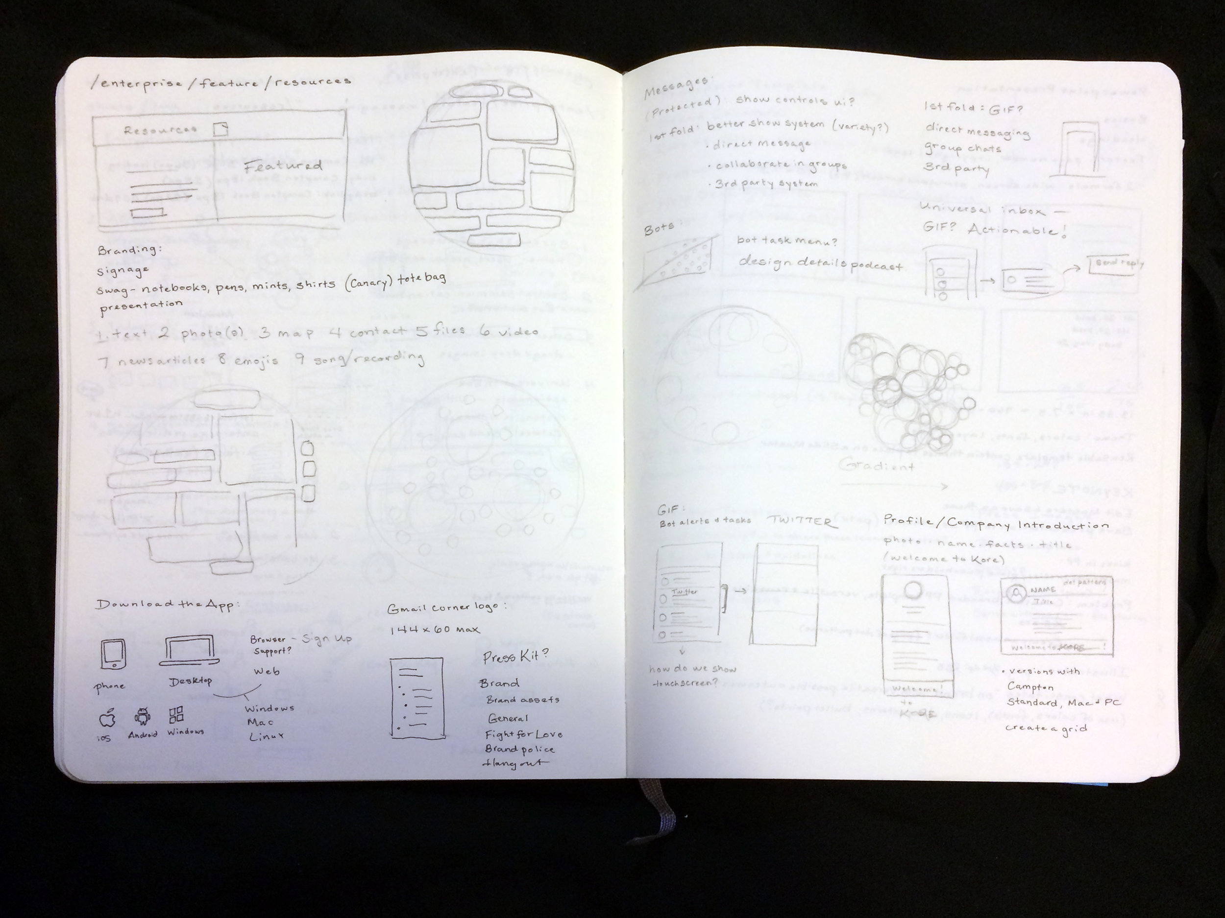
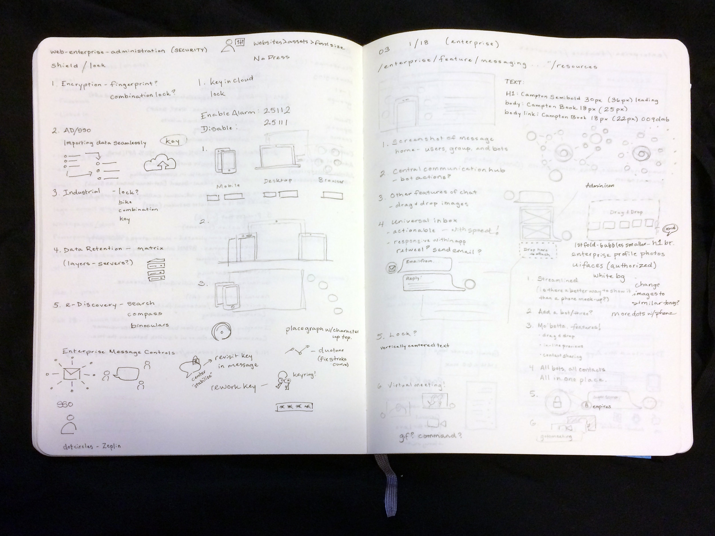
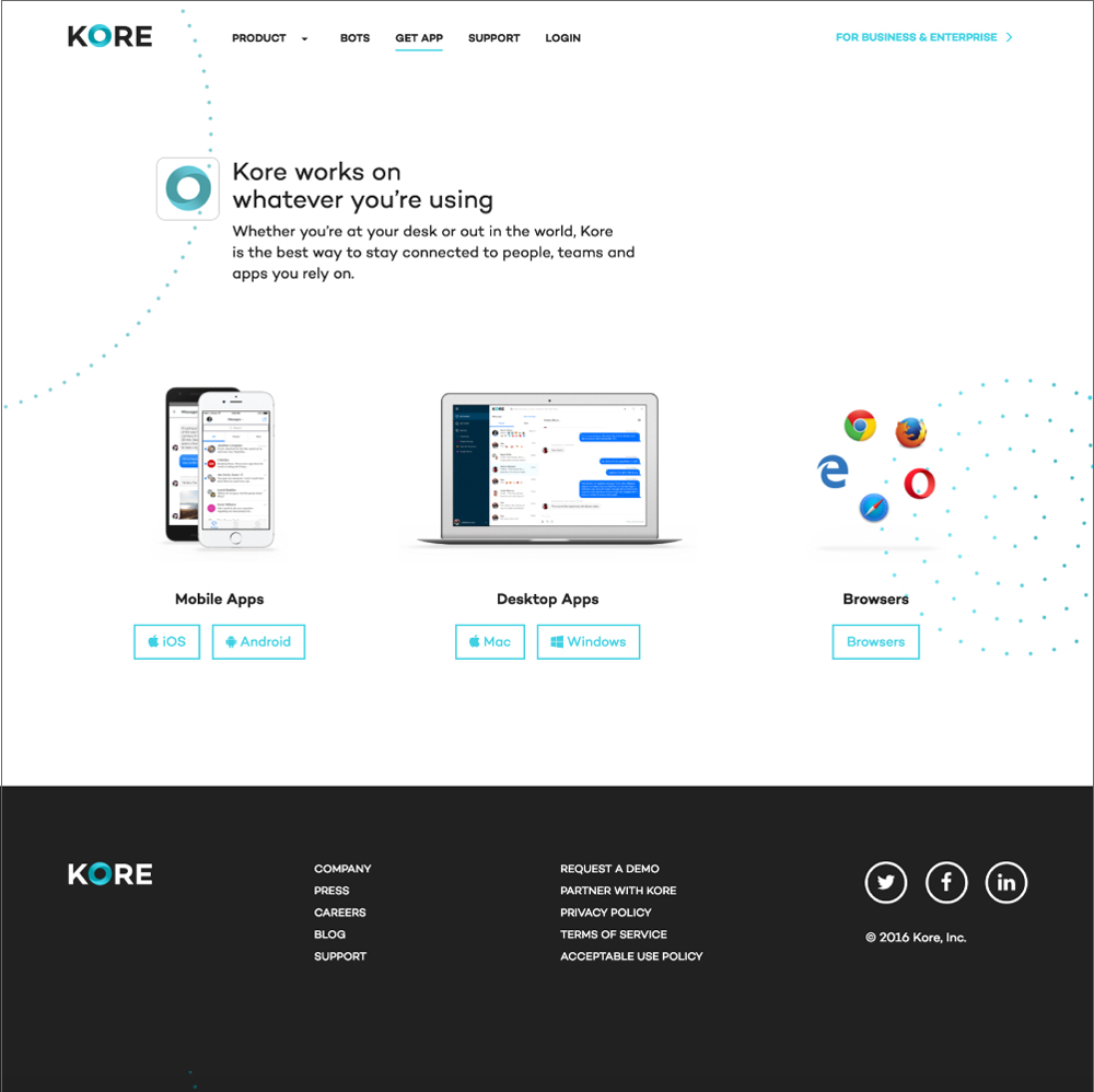
The team set a timeline to complete the website redesign in 6 weeks, every page planned out into weekly design sprints. We worked systematically through each page of the website, sketching first, collaborating with the copywriter and developers, making illustrations and compiling final designs in Adobe Illustrator.
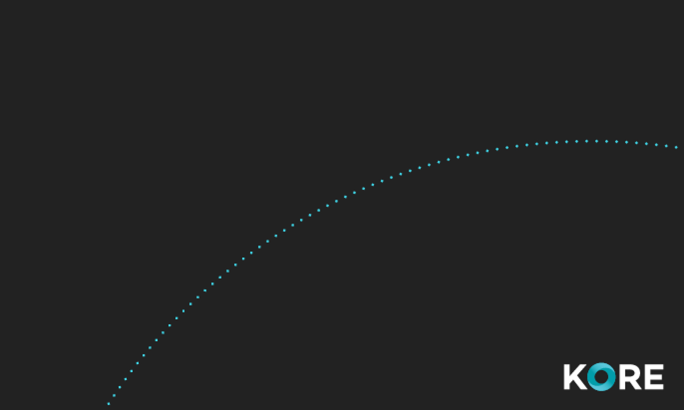
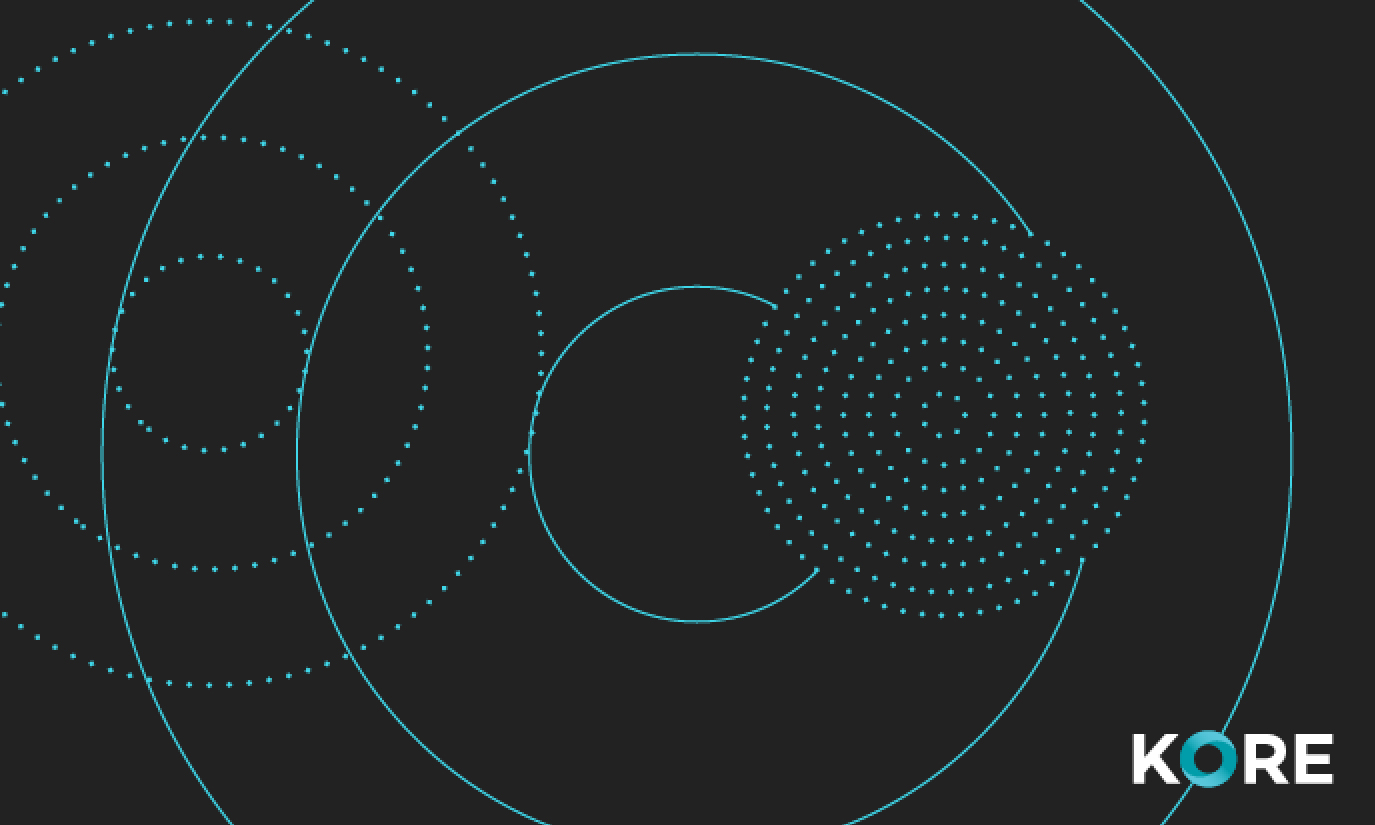
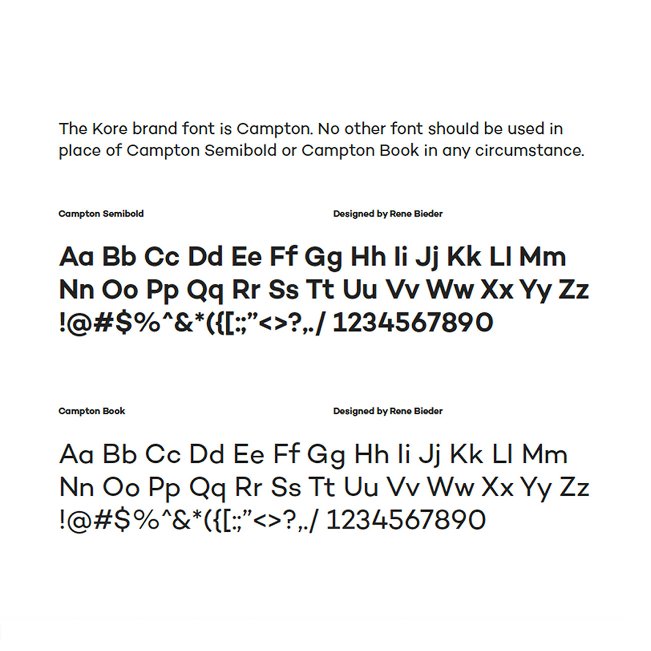
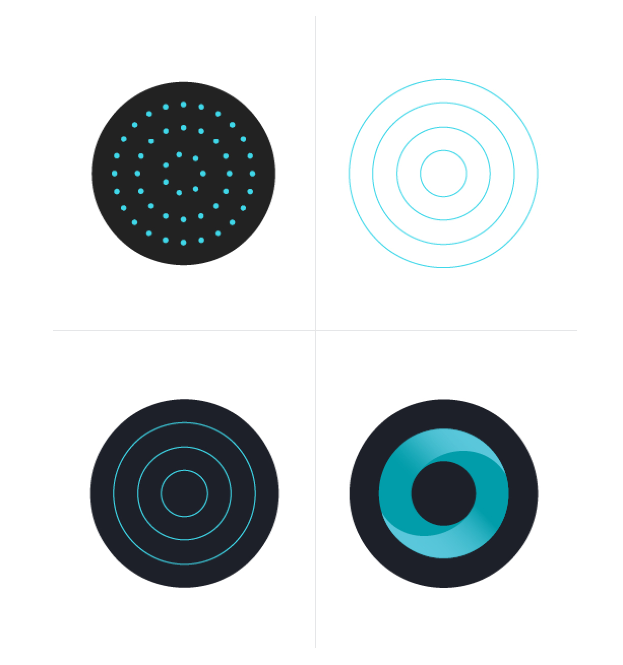
We worked with Fuzzco to create a good base for our rebrand. Kore incorporates many different services and features, so we wanted to develop a system that would show ethereal connections with simple abstract illustrative patterns.
Ease and clarity of communication with teams at scale
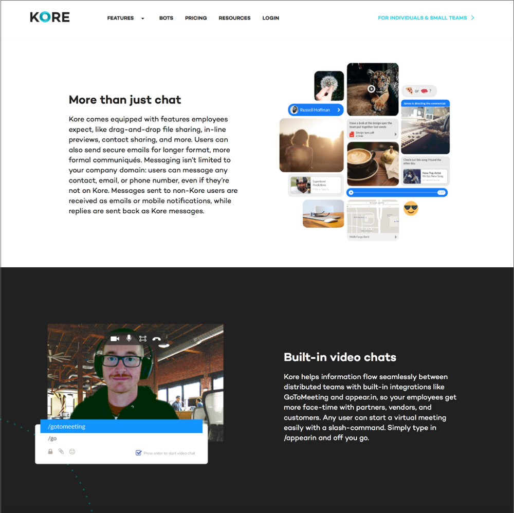
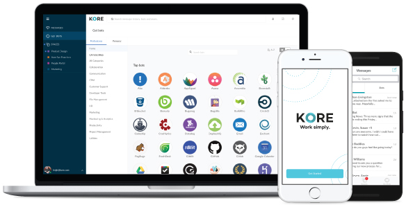
We were designing for two groups of consumers: Business & Enterprise and Individuals and Small Teams. We wanted to educate both groups on the features of our messaging system and bots platform. Bots would allow the user to carry out different tasks from within Kore. Replying to a thread in Gmail, composing a tweet, making a new task in Asana– all could be done by these bots within Kore. Research showed that the messaging system was more secure than Slack, and could support varieties of media, from videos, images, and complex files to map locations and shared contact info. It was easy to search and organized into different spaces and rooms. A user could program a message to be sent out at a certain time, set it to expire within minutes of opening, or even restrict viewing access to a certain geographical location. These were nice bells and whistles, but we wanted to show the ease and clarity of using Kore to communicate with teams both large and small and the ability to accomplish tasks cross-platforms with the bots hosted.
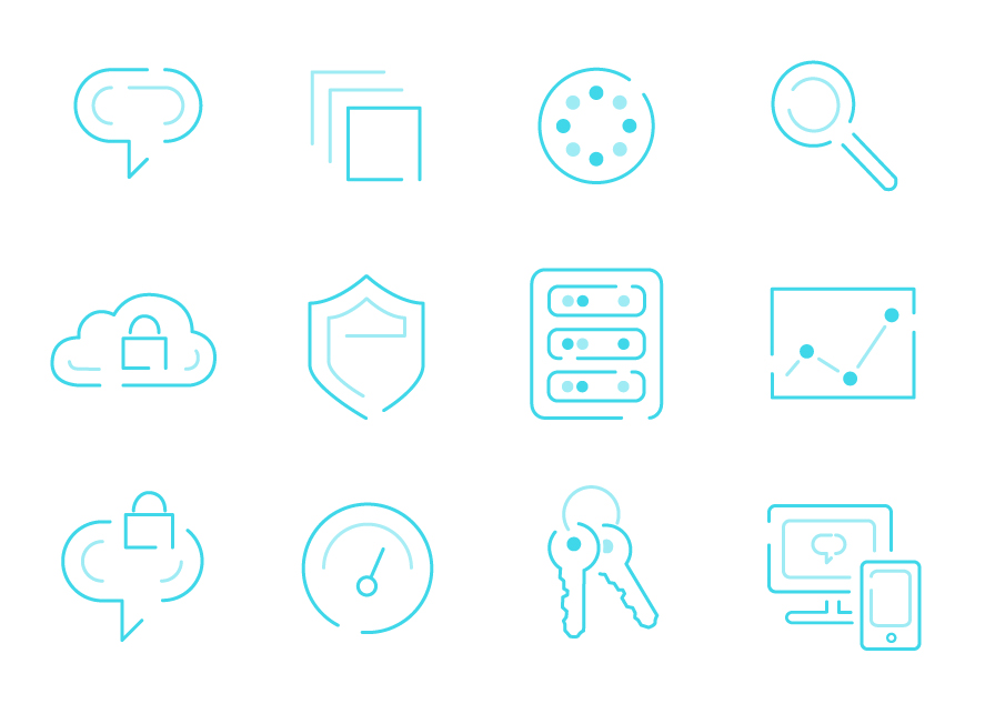
Some pages/app features required more icons that followed the illustrative style of Kore's brand. I enjoyed the new challenge of illustrating these, displayed on the Administrative page:
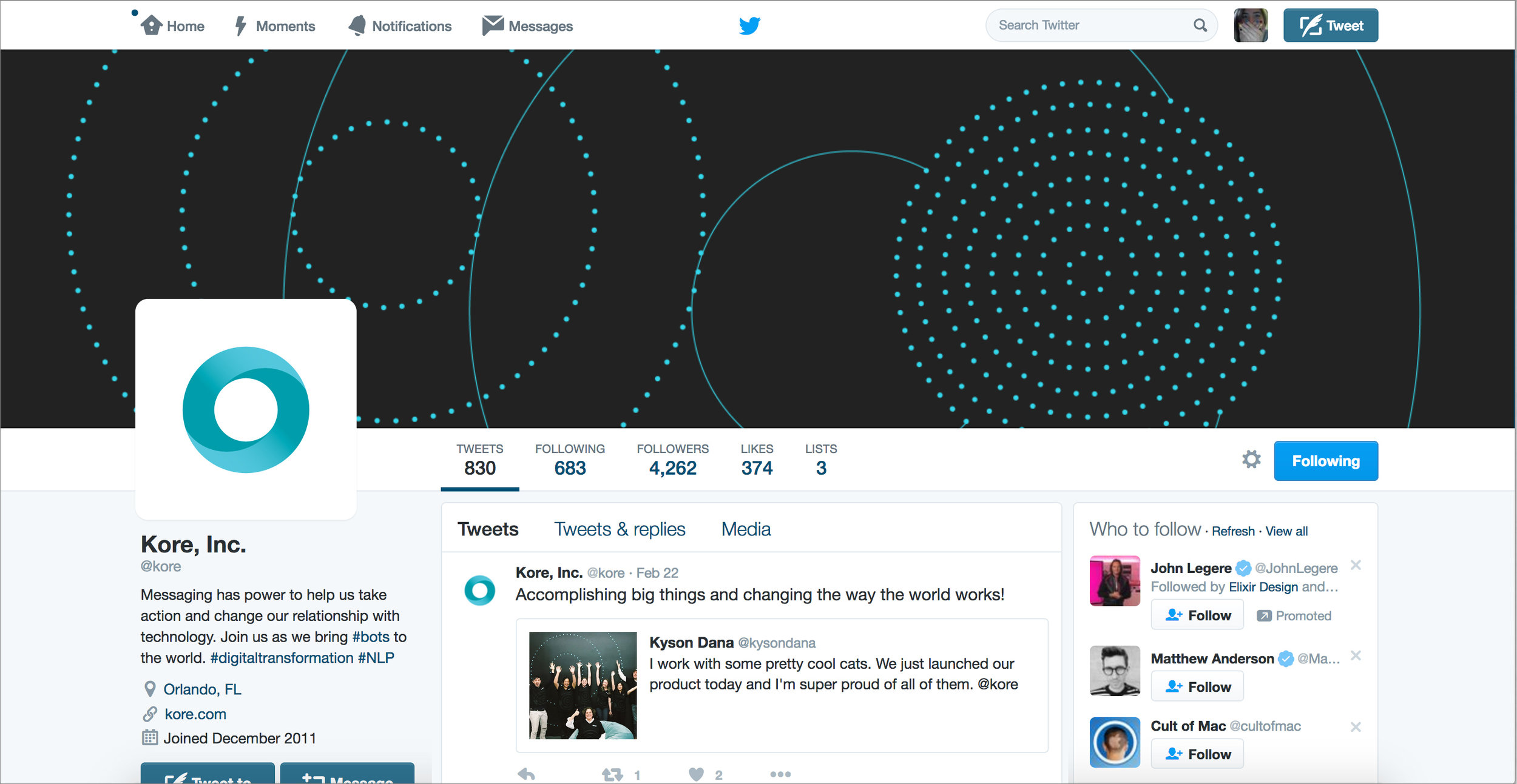
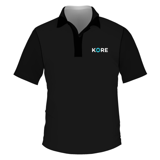
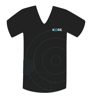
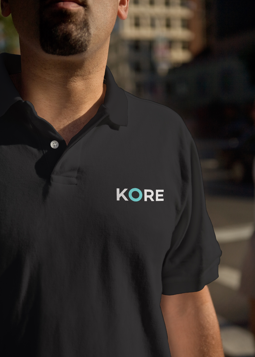
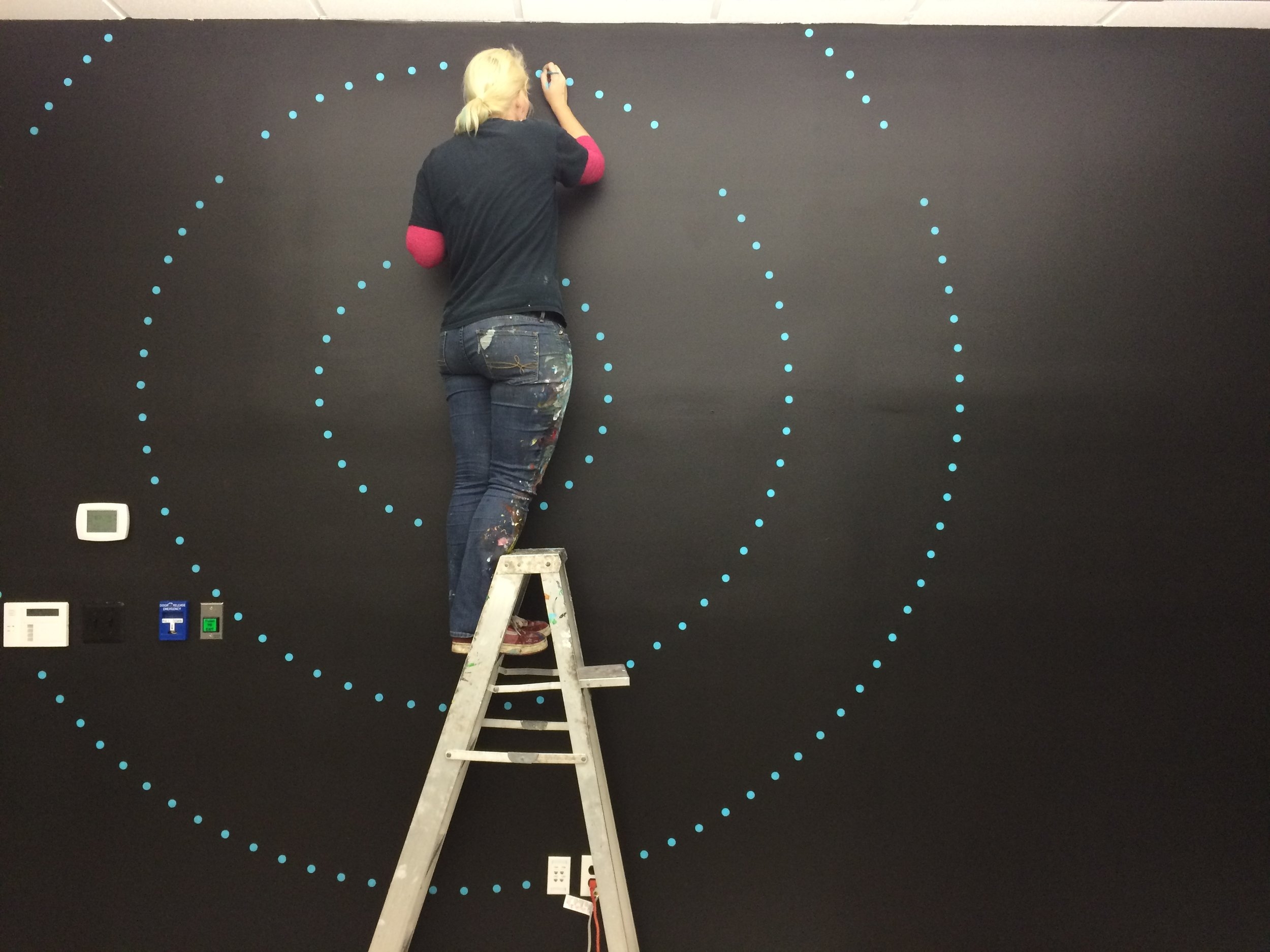
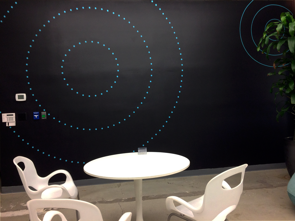
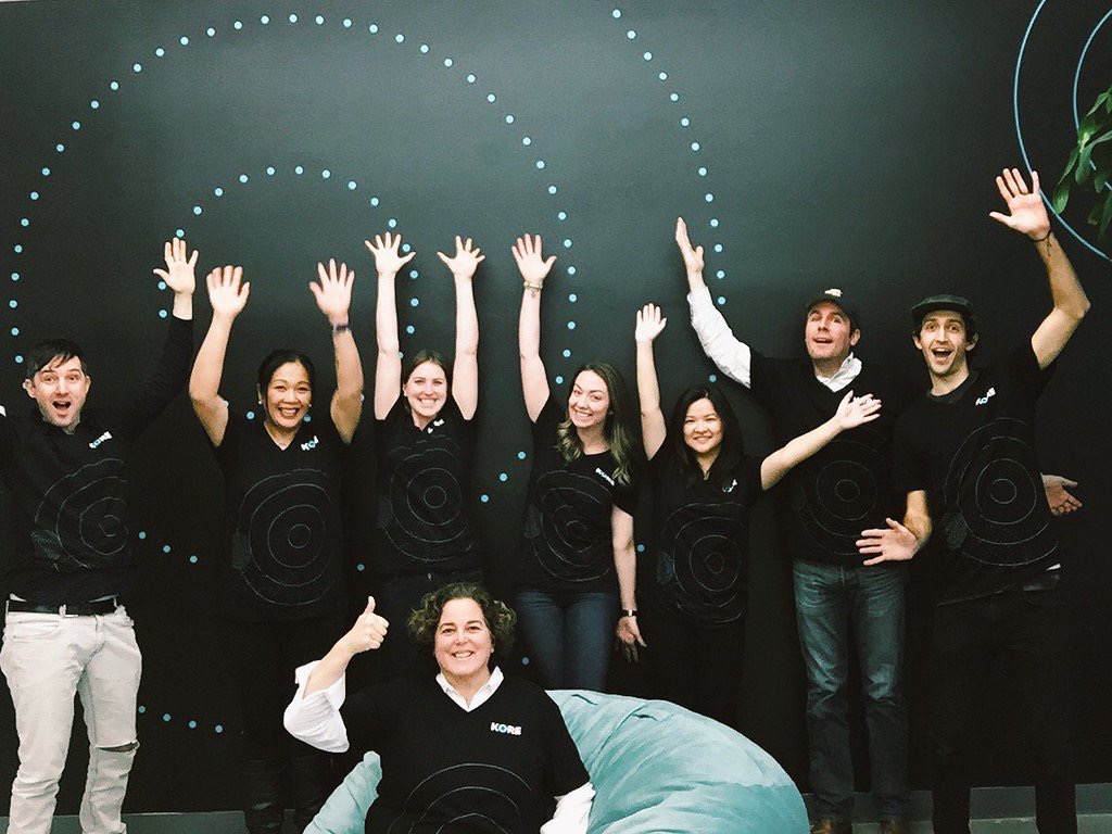
Amidst the excitement of helping with the new site, I ensured that the new brand was being implemented across all social media platforms, press images, and anywhere the old branding was shown. We ordered new business cards, letterhead and envelopes, and t-shirts to commemorate the launch. I designed a few mural options, which our team voted on and we hired a professional muralist to paint it in the main entrance to our office.
Simplifying all aspects of a complex product
Everyone was really hyped for launch day. There were a few bugs being worked out on the product side of things, but the design team had the satisfaction of doing our best and coming away with some work that we were proud of. Throughout the entire process, we came to a united front on the style of what all representation should be: clear, simple, with a few undistracting elements when needed for further clarity. The brand is not busy, overzealous, or too wordy. The design team felt good about working to simplify all aspects of a complex product, despite attempts to over-explain or sound too sales-y. We kept the end-user in mind, distilling ideas down to quick and understandable points, thinking of the most useful cases to the customer.
A great brand needs both form and function
We were hired to redefine a brand that had many problems, which was challenging, exciting, and exactly the kind of project I felt great working on. Before the rebrand, the interface was clunky and crowded with too many extra options, the look was outdated. The majority of the team headquartered in Orlando had been stuck doing and thinking in a certain business way, and procedures and designs were rarely challenged to move forward or take a different approach.
I had the opportunity to work with some really talented, intelligent designers, and I learned more on this project about challenging opinions of leaders in c-suite and above to work for a better design overall. I came away with work I am proud of.
However, the app did not get funding, and we were laid off less than a month after launch. The CEO had a reputation for making quick decisions, and was not one to keep the same methods if a plan did not show immediate success. The marketing and sales team had a challenge to sell a product that kept breaking every week when the outsourced engineers would push a new deploy, fixing any bugs that were made by fixing previous bugs.
I learned that it truly takes a team working hard in the right direction. If the product needs more work or keeps breaking, it's probably not a great time to hire dozens of sales employees to push a broken app. Designers can make a product easy to use and clean up navigations, but this is no good if the product itself is not functioning properly. You can put lipstick on a pig, but it's still going to be a pig. The product itself needs to reflect a great experience for the design to work in tandem. This can be accomplished if there is clear communication of goals and a team working together to solve for problems using their skill sets. A product needs to be challenged and companies questioned on their mission and operations — if the brand is strong, the solution will align with the integral mission and hold up to criticism.
Art Director: Nathan Burazer
UX Designer: Kyson Dana
Muralist: Lindsey Millikan


